

Case Study
Bringing Clarity to Complex Satellite Operations
My Role
Director of UX/UI Design
KVH Industries
Satellite Communications Platform
Owned the end-to-end redesign of the satellite communications platform UI, translating complex technical requirements into a clear, scalable interface. Collaborated closely with engineering and operations teams to define information architecture, interaction patterns, and design standards that improved usability and supported long-term platform growth.
Challenge
When a Platform Outgrows Its UI
- The legacy UI evolved organically and lacked a cohesive structure.
- Navigation, hierarchy, and workflows made it difficult to locate critical system information quickly.
- As the platform expanded, new features were added without a scalable interaction or layout model.
The Challenge
Redesign a mission-critical platform UI that could scale with growing functionality while improving clarity, usability, and operational efficiency.
Approach
From Requirements to Production
Translating complex technical requirements into a clear, scalable UI through close collaboration with engineering and operations teams.
Info Architecture & Hierarchy
Restructured the UI around a clearer information model, reducing nested views and improving findability.
Layout System & Design Standards
Defined a modular layout system and reusable components to ensure consistency across the interface.
Color, Typography & Clarity
Applied visual standards to improve hierarchy, scannability, and system status recognition.
Visual System in Practice
Examples of the redesigned platform UI applied across key screens and workflows. Click any image to view full size.
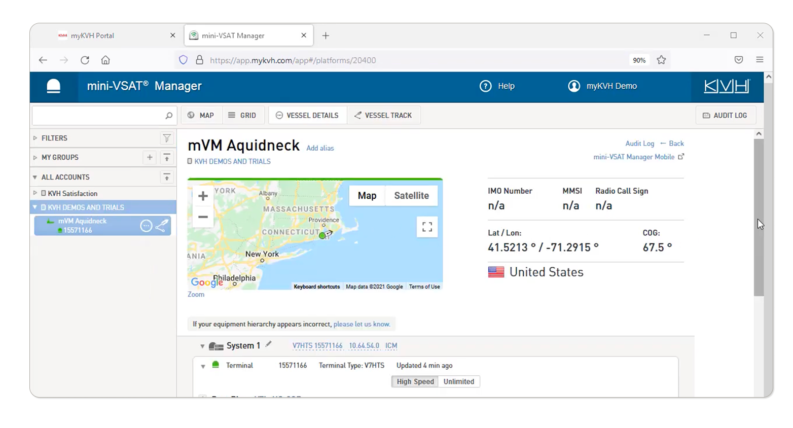
Pre-redesign interface lacking responsive layout and a defined visual hierarchy.
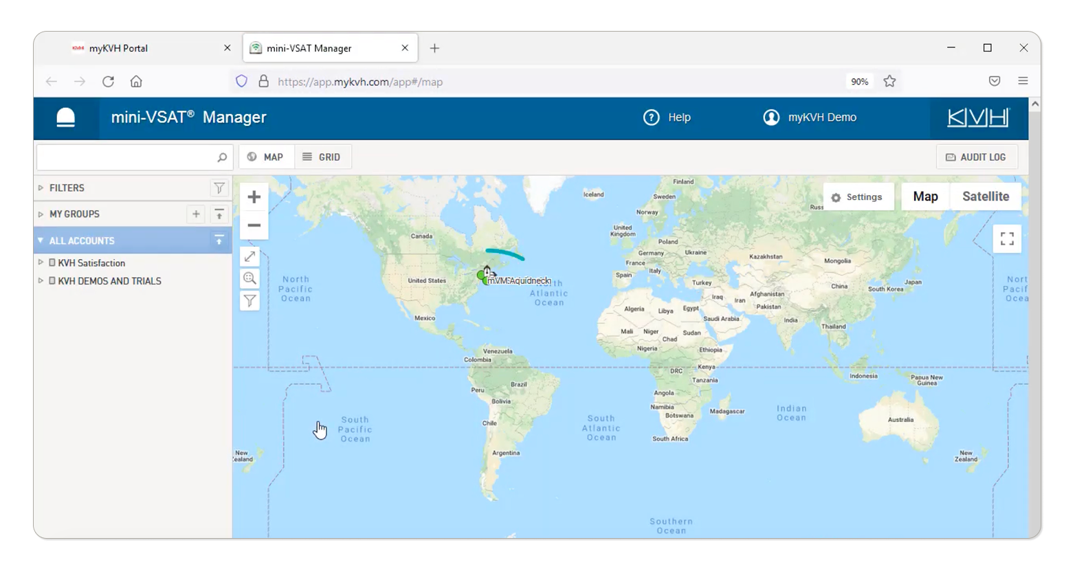
Legacy UI with dense data and limited hierarchy.
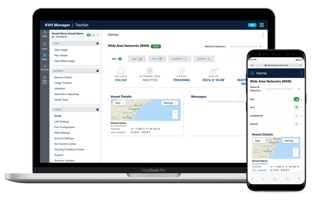
Clearer hierarchy, easier scanning.
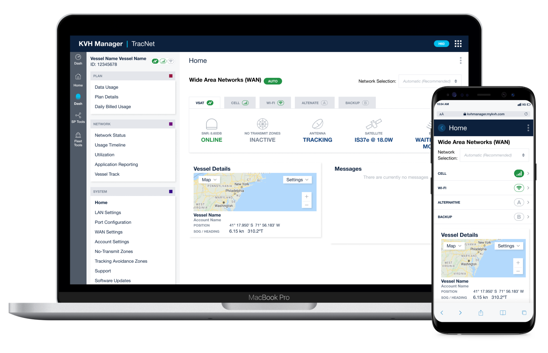
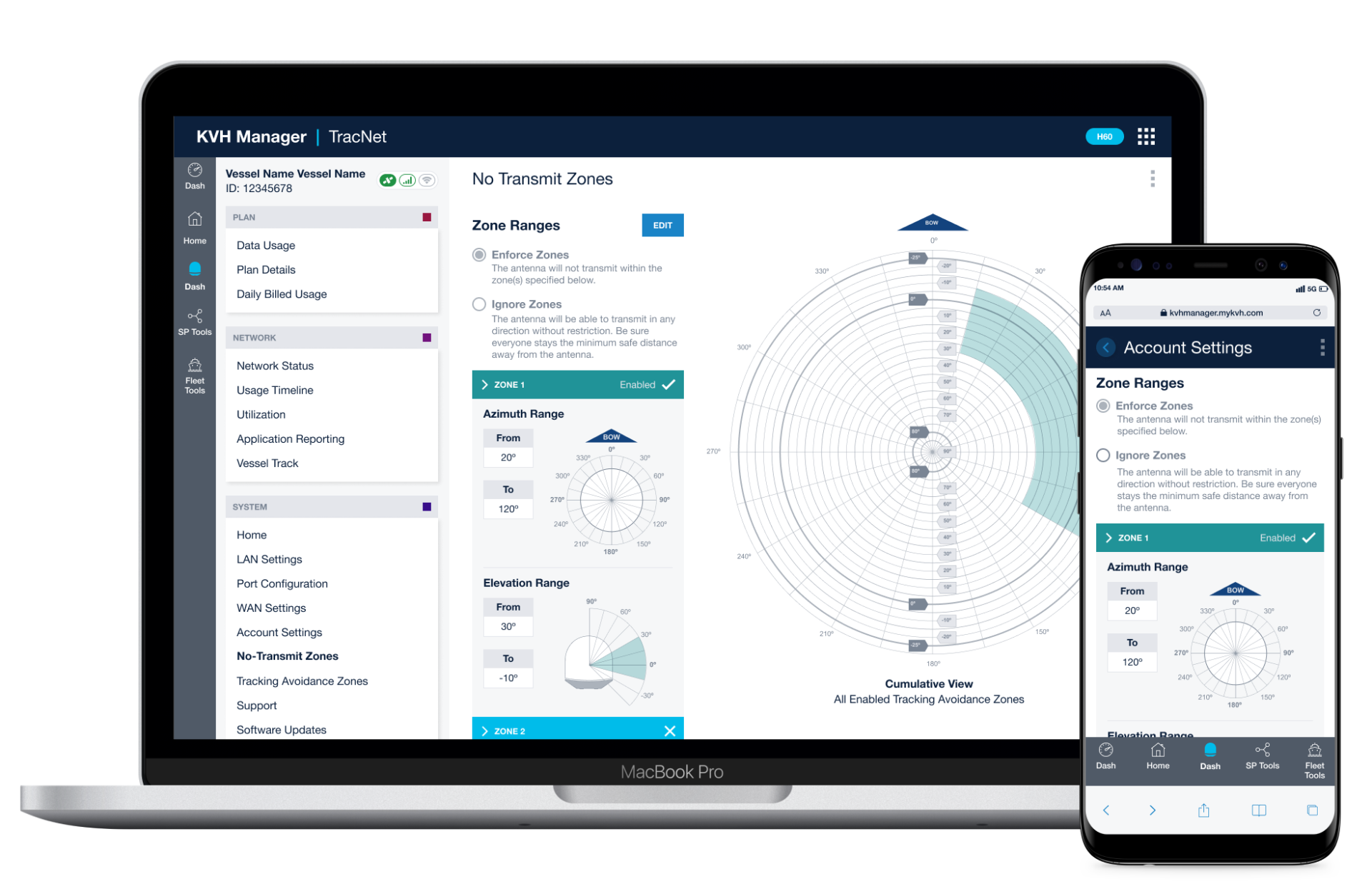
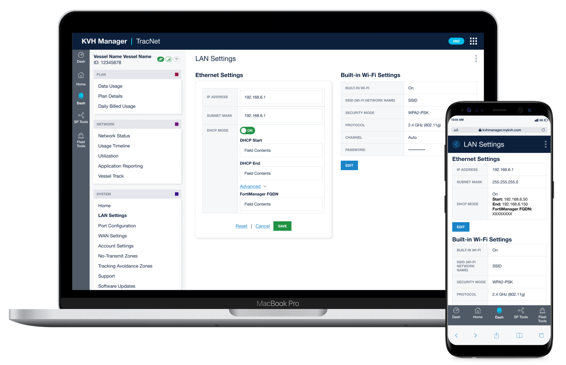
Desktop and mobile, unified UX.
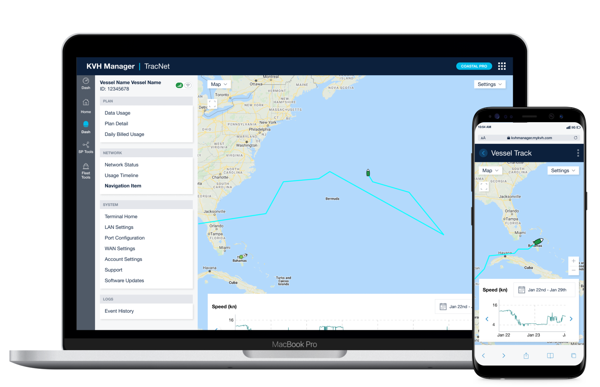
Complex functionality, clearly visualized.
Visualizing advanced features with clarity.
Results & Impact
Operational Clarity at Scale
The redesigned UI improved usability, reduced operational friction, and established a scalable foundation for continued platform growth.
Faster Development
Established a documented design system and UI patterns that streamlined implementation and iteration.
Improved Usability
Simplified navigation and workflows for faster access to critical system information.
Built for Long-Term Growth
Created a scalable UI foundation supporting new features and platform expansion.
Reduced Training Overhead
Clearer patterns and hierarchy lowered the learning curve for new users.
Explore Related Case Studies
Turning Complex Research into Usable Insight
Turning dense research into clear visuals.
Rebuilding a Brand Across Digital Experiences
Rolling out a new brand across digital experiences.